
Full-stack HRMS MVP showcasing enterprise scalability to power up $14M Series A.
The Why?
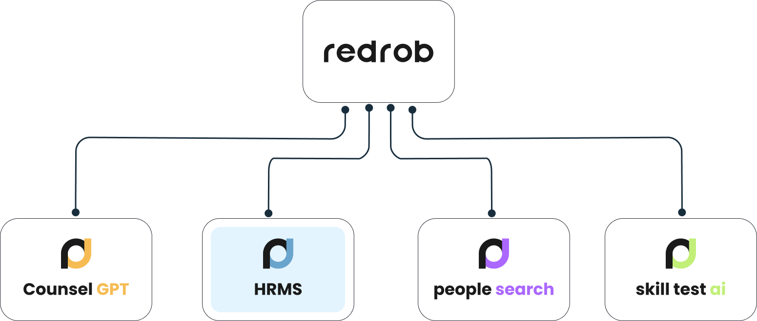
Designed as part of a larger enterprise suite to demonstrate scale and maturity for Series A investment.
The HRMS was conceived as a strategic product module, not for immediate market launch.
It covered:
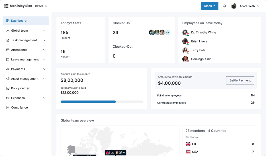
Task Management, Leave Management, Asset Allocation, Global Payroll, Team Management, Expense Management
The intent was clear: show investors a complete, scalable HR solution that fit into the broader product suite vision.
Core problem and opportunity
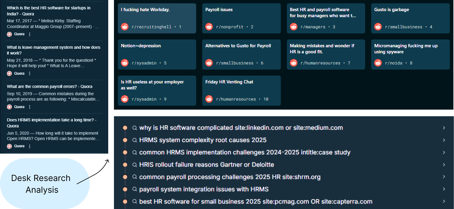
Problem: From stakeholder conversations and desk research, we uncovered recurring pain points:
Fragmented workflows (leave, payroll, assets across different tools)
Employee confusion around balances, expenses, and task visibility
Admin inefficiency in reconciling HR + Finance data
Competitors (Workday, BambooHR, Zoho) were powerful but overly complex
Opportunity: Build a lean, modular HRMS that was both scalable and easy to use.
My Role
I contributed as Product Designer, responsible for solving the critical challenge of improving the user experience for an NLP-powered people search engine with sparse data. My focus was on designing interaction flows and fallback mechanisms that minimized user frustration, retained engagement, and reinforced the system's reliability.
Team
Cross functional team comprising UX designers (including myself), visual designers, frontend developers, backend engineers, data scientists.
Our primary goals
Laying the groundwork through Desk Research!
Explorations and dropped solutions
Each module required different approaches for Admin and Employee roles. Here's what we explored, what failed, and why we pivoted. (Including few flows to keep study concise)


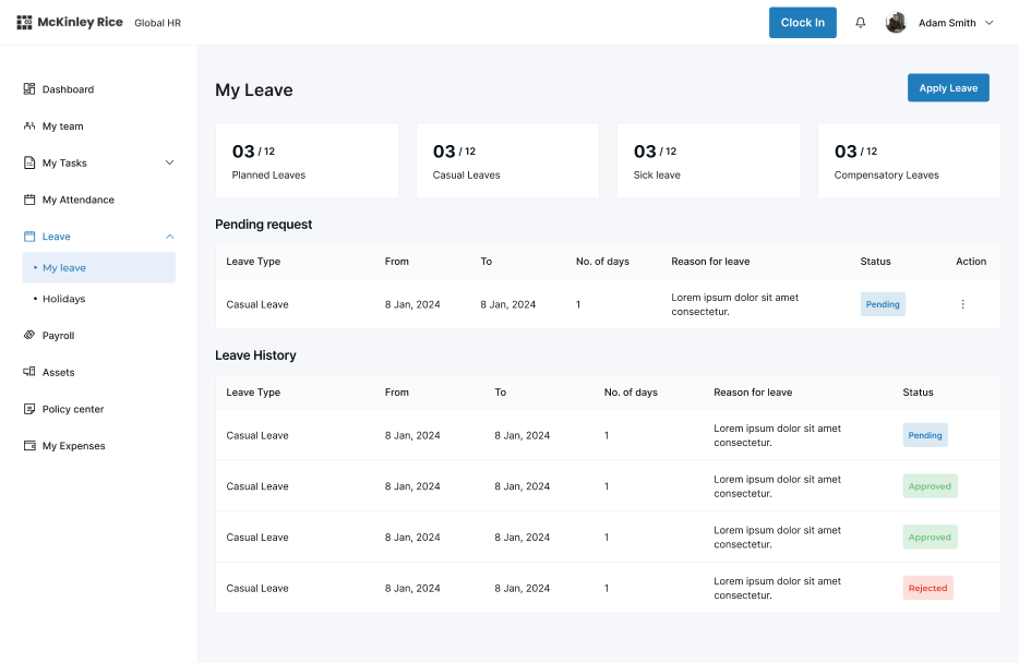
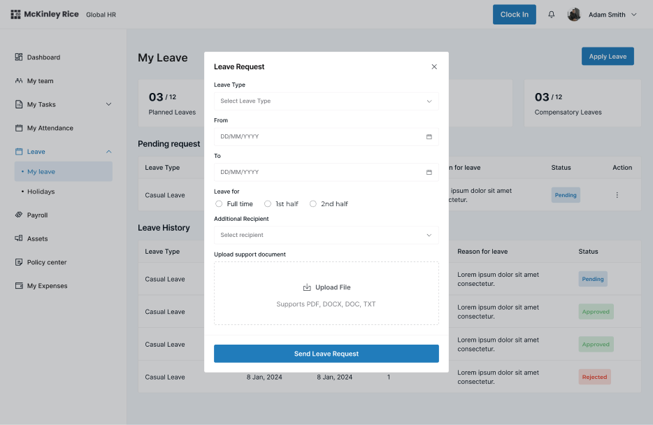
Leave Management flow
How employees would request and track their leave applications
What we did? The Initial Approach..
Calendar-first UI where employees could drag-and-drop leave blocks directly onto dates, with color coding by leave type.


The Problem:
Felt like project management software. Employees found the drag-and-drop overwhelming and confusing for a simple leave request.
Final Decision:
Shifted to form-first flow with leave balance clearly visible at the top. Simple dropdown for leave type, date picker, and one-click submit.
What we did?
Limited the scope of filters and kept only the most widely used (found through secondary research)
Created the new combination of filter queries through stacking “OR” and “AND” conditions
💡Bonus idea: We leveraged AI to provide more relevant suggestions from our database for search queries, broadening the results


Solution design
Now for the final search UX logic flow; we combined these solutions into a cohesive fallback mechanism.
Initial Query Handling:
Parse the user query and match with the database.
Convert natural language query (NLP) into filter query through AI.
Suggest relevant filters respectively.
If results are zero, initiate fallback logic.
Fallback Mechanism:
Dynamically loosen filters as per the priority and importance (e.g., expand relevant skill match, location radius).
Display results with alternative suggestions following the OR condition.

Here come’s the new and better search engine🤓
These screens are animated in structured flow. However, you can tap on dots below to navigate😄


Impact!
40%
24%
16%
Key learnings
1.
Designing for Real-World Constraints
Solving user problems with limited data required a creative approach that balanced user expectations with system capabilities. This reinforced the importance of designing solutions that work even in suboptimal scenarios.
2.
Empathy-Driven Solutions
Users value transparency and control. Communicating filter adjustments clearly and offering actionable alternatives enhanced trust and usability.
3.
Collaborative Problem-Solving
Close collaboration with engineers and data scientists was crucial in aligning technical feasibility with user-centric design, ensuring the solution was both functional and intuitive.
4.
Iterative Design for Impact
Continuous testing and refinement of fallback mechanisms emphasized how small interaction tweaks, like clear messaging or interactive filters, can significantly improve the overall experience.